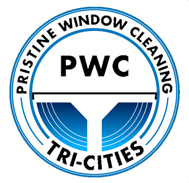
Never really came up with my own logo. Looking for suggestions, any critics welcome! My web site is pwctricities.com
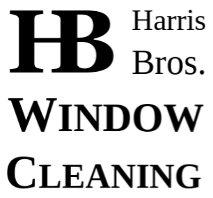
So this is what I came up with so far.

1 Like
If it was me I’d make the letters easier to read. A more solid themed font. Maybe have something like 3 buildings to represent the “tri cities” .
Make the colors more uniform. Narrow down maybe 1 blue and another.
2 Likes
Thanks @Luke
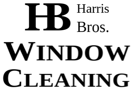
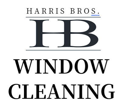
This is what I’ve got so far. Going to make changes, but you get the idea.
Merry Christmas @Stoneface
Merry Christmas, @Luke. Appreciate the seasons greetings.
1 Like
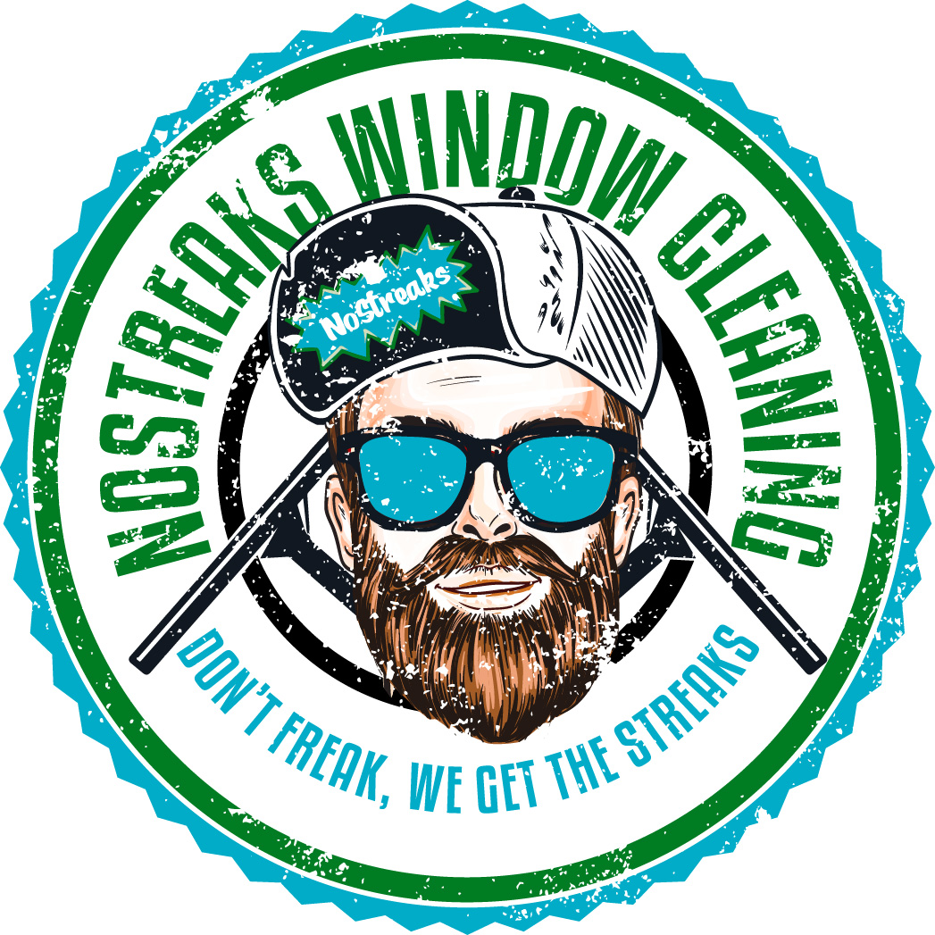
I personally like the badge type of logo, this is what I ended up with. I went through Fiverr, it was really affordable and I was able to get unlimited revisions.
Which tri-cities is this? I’m from Washington state, tri-cities to me is Richland, Pasco, and Kennewick.
I agree with @Luke, I would have one blue and another color. You’ll want something to pop, grab attention, make it different too. For me, my competition all used a squeegee or a water drop in their logo, I wanted to stand out. Just my two cents, keep at it, make sure when you decide that you love it. I imagine re-branding isn’t too much fun.
Best of luck!
1 Like
Thanks! I’m in NE Tennessee. Tri-cities is Johnson City, Kingsport, and Bristol. I live in a smaller town within this area.
2 Likes
Standard tips for logos are:
It should be readable in different sizes, black-and-white, and so on, in more difficult conditions, that is.
Thank you @JJones for putting together a nice logo for me! I got the transparency figured out and even figured out how to turn it into an icon on my phone. Awesome job!
1 Like
Awesome glad you like it.
Here’s the one I’m having put on tShirts for me.
I think this looks good. The name of the game is clean, unique and simple. The few other companies in our area seem like your usual redneck name-and-phone number. Yours looks good.
Another plus, (where my logo sucks) is you only have roughly 2 colors and it could be printed monochrome on shirts and marketing materials. The 4 colors and fine details in mine make screen printing nearly impossible or a fortune.
1 Like
@AutumnRidge you can look for someone that does sublimation printing. This is a printing process that actually dyes the fabric and typically cheaper and more durable then screen printing.
1 Like
shouldn’t your number be in with the logo?
I think that’s a pretty decent idea. But I think a logo should be viewed more as a trademark stamp or icon. Don’t worry I plaster my phone number everywhere else though